top of page
Meg Stessman
Work
 Engravers ScriptA marriage between Engraver's MT and Edwardian Script. Inspired by my years in ballet, this font has both command and delicate intrigue. |  Silkscreen Portfolio BoxA handmade box containing a small sample of silkscreen prints. The entire piece was printed using only silkscreen. |  Silkscreen Portfolio BoxThis piece was created almost 1 year ago for an Intro to Printmaking class. I was the only one in the class to print and construct a 3D project. |
|---|---|---|
 Silkscreen Portfolio BoxThe box featured a sampling of prints, an "about me" list inside the lid, a digital portfolio, and my contact information. |  Silkscreen Portfolio BoxThis project was the starting point for my brand today. The egg logo plays off of my name, Meg, but it also represents my incubation and growth in design. I am far from hatched, but like most eggs, I'd like to think I have potential. |  MM BandagesPackaging an everyday product, bandages, in a way that will make it stand out from the crowd. By building a fictitious brand from a true story, the packaging stands out from other boxes with its look, but hooks the consumer in using humor and quirk. |
 MM BandagesThis project is inspired by my sister's childhood obsession with bandages and wound safety. |  The Folded Paper WalnutThe assignment: make a food item of our choosing out of folded paper, incorporating movable parts. The starting point is the triangle tab. |  The Folded Paper WalnutIn order to get to the meat of a walnut, you must tear away the husk of printer paper starting with the triangle tab. This husk was left open to show the shell inside. |
 The Folded Paper WalnutInside the husk, the shell of the nut slides open to reveal the meat of the nut, which can be removed from the shell. |  Shawnee Heights Public Schools FoundThe Shawnee Heights Public Schools Foundation has long needed an identity and logo to give the organization clarity in its outreach to the community. |  The Breakfast ClubA set of icons made using elements of Adabi Condensed Medium and Adabi Condensed Extra Bold. Instead of a set of standard icons, The Breakfast Club brings quirk and personality to a font that is often overlooked. |
 Game Cover & ConceptBased on the work of M.C. Escher, E-Scape is a maze game where the the gamer must navigate through the "impossible spaces" based off of Escher's landscapes. The logo's "S" is made from a mobius strip that connects to both ends of the "E," making the logo itself the simplest of "impossible spaces." |  Game Cover & ConceptConceptually, the parameters of the game were a group project. I had a heavy hand in the concept, and then we independently designed separate covers. This was my cover. | 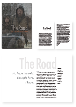 The RoadCormac McCarthy's The Road featured a black book cover with the title in white, giving the viewer no clue to the story inside. My assignment was to redesign the book cover, the body text, and create a text composition using poignant pieces of the book. |
bottom of page